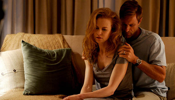
Turns out I was wrong for the most part.

Via HitFix, click to embiggen.
Yes, the font is simple, but it's subtle and elegant. I like how it's as if we're seeing the sky through a misty windscreen and through the title it is clearer, where we can see through to a deeper hue of blue. And that image of Kidman is lovely. As for the O made from a child's backyard swing? Well, it's a bit precious, and the tagline is on the nose, but a movie like this has got to sell tickets and you don't do that by appearing to be 120 minutes of miserablism. Precious (also from Lionsgate) new that last year; you gotta sell the happy. So, again, I can forgive it.
Also, I just think the movie looks incredible so I don't care. 99% of the internet didn't seem to care that the Inception posters were rubbish, so why should I care about this? I shan't. Click the "Rabbit Hole" tag below to read more about my anticipation for this film if you don't believe me.